New Bumble, Who Dis? 5 Changes to the Bumble App
Our cheat sheet on the new
Bumble features
Yes, good old Bumble has been working behind the scenes to put together the latest look. They revealed their makeover on Monday with their subtle, not-so-subtle, app update. Anytime there's a change to something we use regularly, you can almost guarantee a resistance. But don't worry, I've scoped it out and have included the highlights so you can still look your best online.
Bumble Change #1: LAYOUT

The first thing you'll notice - a new layout. Now, everything is scrolling. Your dating profile bio, your IG and your spotify account are now seamlessly integrated into a single-page, scrolling profile. This idea works in tandem with how the majority of digital content is consumed. The change, however, is the location of your dating bio. From the bottom of the profile, Bumble has moved it up to the top, just behind your first dating profile picture. A subtle layout change makes a major impact.
How does this impact you? You have to read the bio now. Thanks to Bumble's heavy encouragement of reading each other's bios, (you literally can't miss it - I see you, Bumble) the company is discreetly expanding it's focus to be more than "looks", and we're here for it! Plus, this new integration is a better introduction of one person to another.
Bumble Change #2 PREFERENCES
This is an interesting and totally new direction for Bumble. They followed Tinder's lead by providing a box for each user to write whatever they wanted with only a few questions about themselves. Bumble's update now includes a "preferences" section which creates subcategories creating more pools to circulate your profile with more like-minded profiles, algorithmically. Think of these as keywords to categorize your profile and then circulate it through groups of people who want the same things. Creating more categories allows for more specific targeting and increased like-minded thinking resulting in more matches.
How does this impact you? These preferences are all very good Qs that we no longer need to ask ourselves - this eliminates dating small talk, saving everyone's time. With these details out the way, the conversation can focus on getting to know each other and building a connection. Nice move, Bumble.
Bumble Change #3 - Dating PROFILE VERIFICATION
This is a new feature and it's another strong move on Bumble's part. This feature, asks Bumble users to submit a selfie for reference. Bumble promotes their interest in their user's security - aka they don't want their users catfishing each other. No one likes a catfish. (If you're unfamiliar with the topic, MTV has been educating the population at large for years, their show, Catfish, has been running for what feels like forever. Peep one episode, and tell me you're not hooked.) But back to Bumble. This new dating profile verification feature will use this picture to reference future profile picture uploads keeping the safety of their users a top priority.
How does this impact you? You will actually be meeting the people you think you will be, their profile will match what they look like irl. Yay to more authenticity online!
Blue Checkmark = Real Human
PRO TIP: Ever wanted that blue checkmark next to your instagram name? Yeah, I know, me too. But now, with Bumble Verification, you get that checkmark. It's, not quite the same thing, but it is equally visually pleasing.
Bumble Change #4 - SOCIAL
Not much of a change here other than their locations on the profile. Instead of showcasing your music interest and your IG under your bio, they are also integrated into the profile scroll. Personally, not a big fan of this change. I think it crowds the profile if both accounts are connected. The full-size pictures of you and then thumbnail images of your favorite artists will make a profile look too busy.
How does this impact you? The aesthetics will take some adjusting time but I still recommend connecting your Spotify and/or IG. This creates space for commonalities to be discovered and a reason to SWIPE RIGHT.
Bumble Change #5 - SUPER SWIPE
This feature resembles the not-so-new feature on Tinder. If you really like this person you super swipe them. However, this is an important dating profile feature, on Bumble this it’s only offered to their premium members.
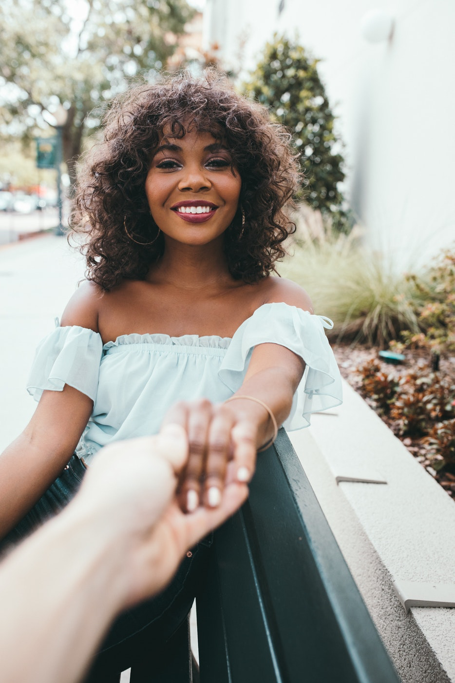
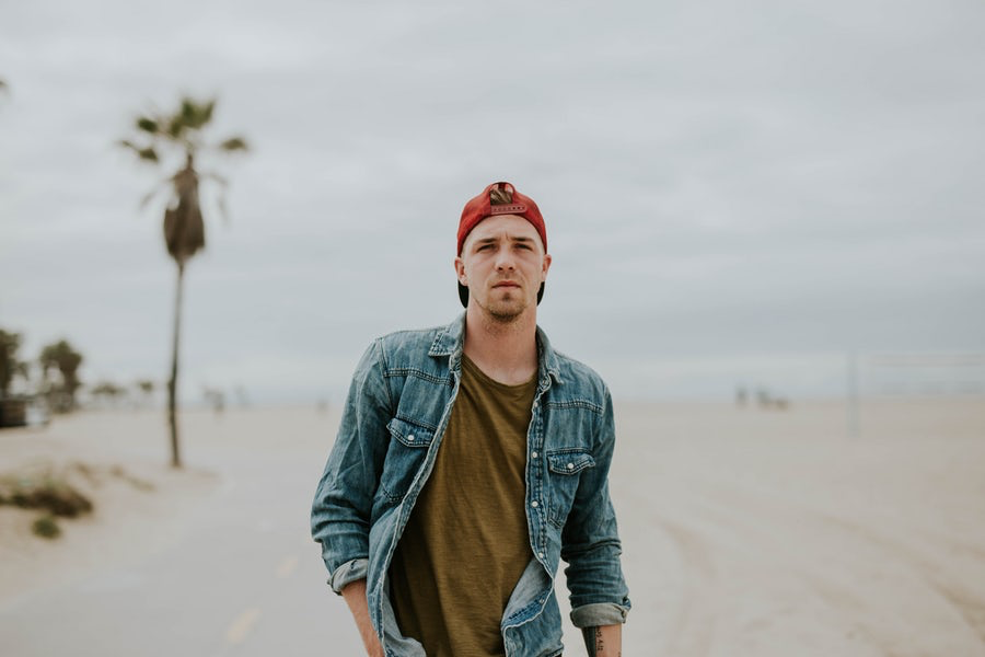
How does this impact you? I recommend continuing to swipe right like normal unless you want to upload your credit card information to your Bumble app. If you're into this premium feature, here are a few examples of the profile pictures worthy of a Super Swipe:


Overall, I'm pleased with the changes, they modernize what was starting to feel like a "dated" online dating platform. Before Hinge grew in popularity, Bumble spent many months atop a steep hill of online dating platforms. They were the platform everyone used until a new approach to online dating emerged. Bumble took some time to figure out their next move and the outcome of those decisions was worth the wait. The scrolling profile is an improvement for the digital introduction, it's smoother and cleaner which when styled correctly, will present you better.
At the end of the day, what does this all mean? Nothing. The principles remain the same, the presentation shifts some of the dating profile pictures so check for cropping issues, aka make sure the auto-formating didn't mistakenly crop half of your head. Other than a few design changes and a few more features, the dating app is the tried and true Bumble we've known for years.
What are your thoughts? Is this update for the better or the worse? Email me your stories and share your ideas. I love hearing from you!